Depending on how many magazines you read (my coffee table is on the verge of buckling under the weight of my Better Homes and Gardens collection), there seems to be a constant buzz around the new “it” color for every one of your interests: interior design, clothing, even nail polish. Who decides these things?
Regarding the former, by now you’re aware the top interior paint color of 2017 is indisputably gray, “the new neutral” imparting a Scandinavian-esque sophistication to so many glossy BH&G spreads and enviable living spaces at large.
But if you’ve ever picked out a paint color, you well know it isn’t as simple as “gray.”
From barely-there sea foams to bold, dusky charcoals, there are hundreds of gray variations to choose from, and while some may not look terribly different on a swatch card, it’s regrettably easy to paint half a room before realizing your cool-tone neutral leans more green than blue, as you envisioned.
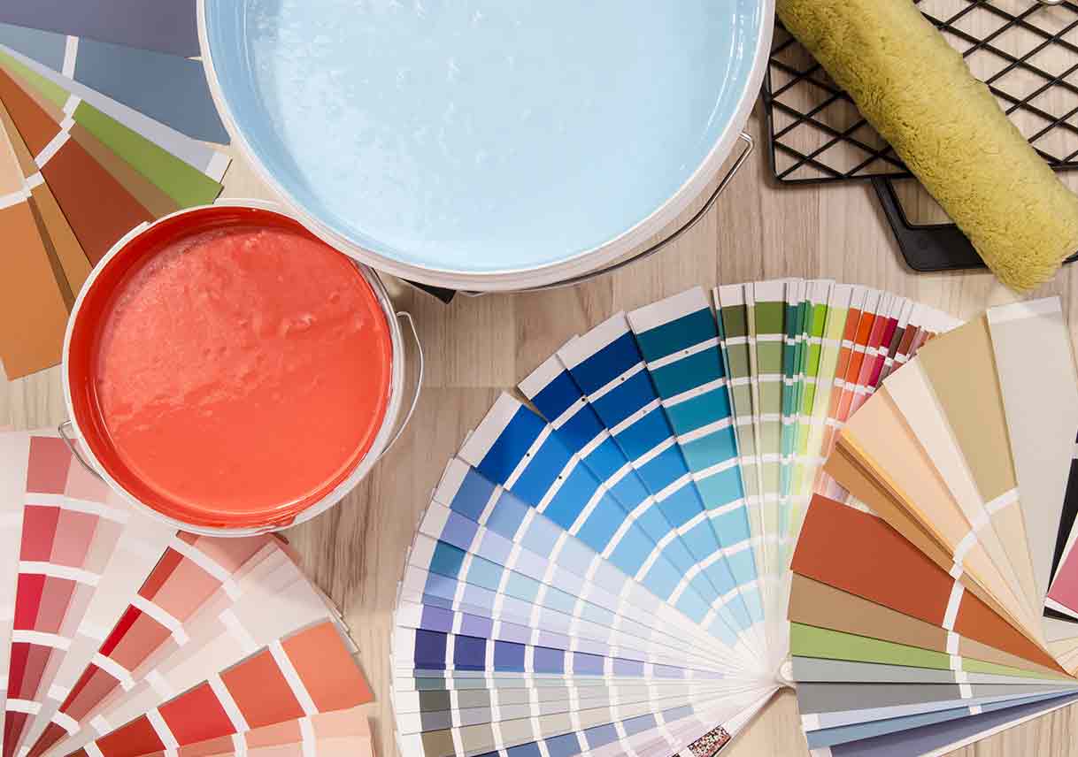
To help narrow your search, we’ve put together an interior color trend guide using several top-selling neutrals as well as a handful of our favorite timeless accent colors from popular interior paint brands.

Top Neutral Paint Colors
Side by side, it’s easier to discern the subtle undertone variations of these popular neutrals:
- Warm brown, yellow, and red undertones: Repose Gray (Sherwin-Williams); Full Moon (Pratt & Lambert) Dover White (Sherwin-Williams); Shades On (Behr); Bleeker Beige (Benjamin Moore); Gravelstone (Behr)
- Cool blue and green undertones: Passive Gray (Sherwin-Williams); Sea Salt (Sherwin-Williams)
**Our favorite:**Since it’s a darker color, Shades On is not technically a neutral, but we think this beautiful mineral gray gives a soft, sober elegance to a textured wall.
Top Accent Paint Colors
When choosing an interior color scheme, start with one important color that portrays the mood you want to set. Spicy Salsa Dancing (Benjamin Moore) has a warm, lusty feel; Endless Sea (Sherwin-Williams) is the quintessential moody blue; Polished Aqua (Behr) recalls a coastal morning; and That’s My Lime is tangy and electric.
**Our favorite:**The rich burnt orange of Benjamin Moore’s Salsa Dancing would look gorgeous accenting a neutral kitchen or warming up a living room.
Modern Color Schemes
Once you choose a primary color, develop your palette by selecting a neutral with complementary undertones, like a cool grey to accompany a deep blue in our Farmhouse palette, or a warm beige along with a rust, like in our Tuscan palette. Or, borrow inspiration from nature, as we did with the dusky ocean blues, grassy green, and sandy neutral of the New Coastal selection.
**Our favorite:**Earthy green, maritime blue, and soft, cool-tone neutrals marry calming with classic in our **Farmhouse **color scheme.
Tips for Choosing the Best Paint Colors
A fresh coat of paint is one of the simplest ways to refresh and modernize your interior. Unless you’re an interior designer, however, it’s not easy to visualize a new color scheme for a given room. And because you often can’t tell the color is off until it’s on the walls, the wrong choice can be an expensive one to correct.
Keep these tips in mind when establishing your color palette:
- Start with the most important color that expresses the mood of the room.
- Pair with a neutral.
- Identify no more than three other complementary colors.
- Find an art piece or fabric that has all the colors you want.
For the best result, hire an expert. A Best Pick painting professional will be well versed in interior color trends and will help guide you through the process, from choosing the best paint color for your home to the final, finished room in all its glory.


